 Graphite
Guides / 10 of 13
Make It Yours
Light and dark, colour themes, typefaces, text size and line length.
Light, dark or automatic
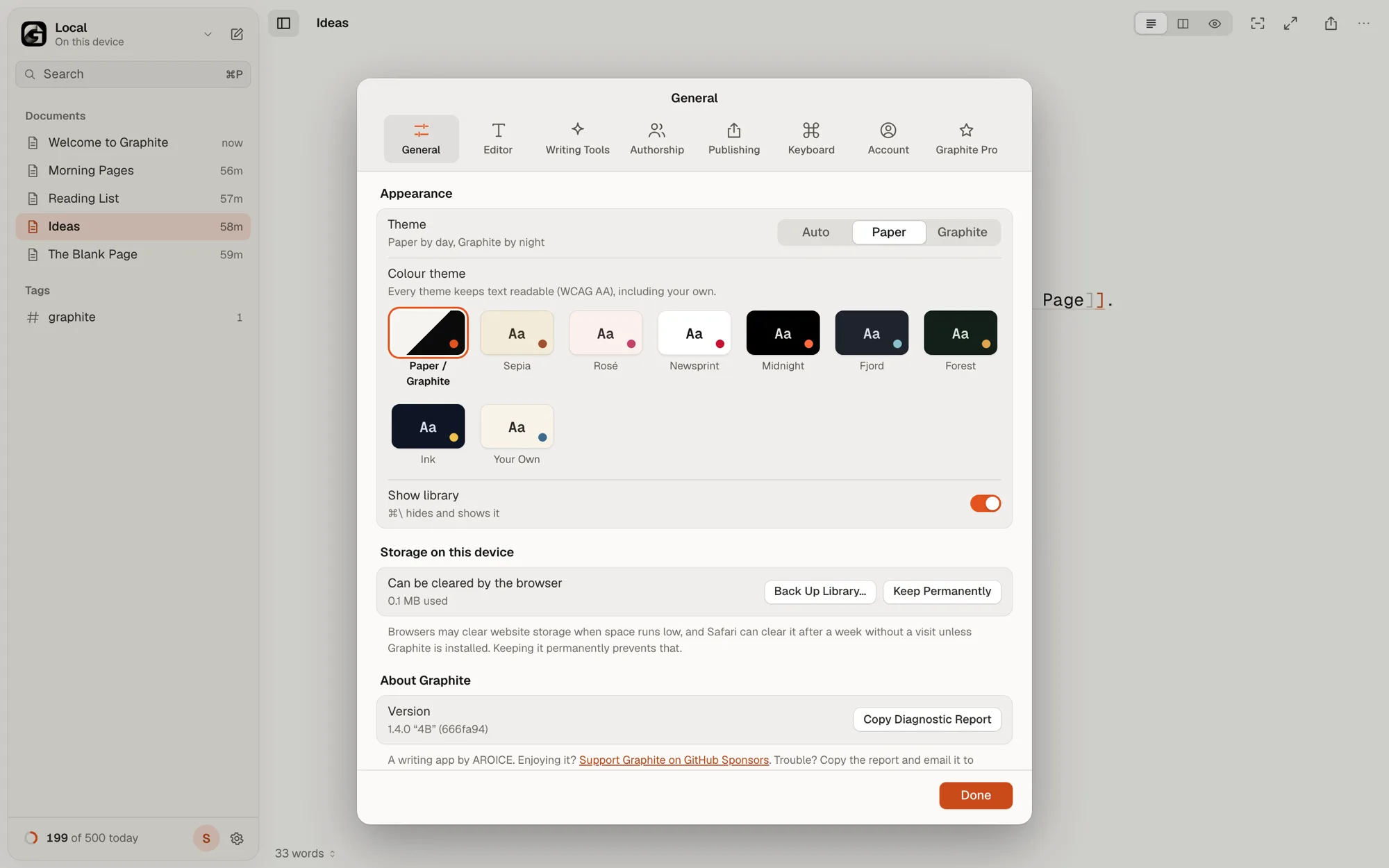
In Settings › General, choose Paper (light), Graphite (dark) or Auto to follow your system. Both are free and both meet WCAG AA contrast.
Colour themes Pro
Below that, pick one of seven themes: Sepia, Rosé, Newsprint, Midnight, Fjord, Forest or Ink.
Or choose Your Own and set three colours: Background, Text and Accent. Graphite works out every other colour from those three and adjusts them until all text is readable. It shows the contrast of your choice, and if it’s too low, Graphite strengthens it for you.
Typeface, size and line length
In Settings › Editor, choose a typeface:
- Free: Geist Mono, IBM Plex Mono and IBM Plex Serif.
- Pro Pro: Literata, Source Serif 4, JetBrains Mono and Atkinson Hyperlegible, a typeface designed for readers with low vision.
Set the text size and line length in the same place, or press ⌘= and ⌘- to change the size as you write.
Comfort and accessibility
- Every theme, including your own, keeps text at WCAG AA contrast or better.
- Everything can be done from the keyboard. See Keyboard Shortcuts, and with Graphite Pro Pro, change any of them.
- If your system asks for reduced motion, Graphite turns off its animations.